|
Building games that can be understood at a glance - Zach Gage, GDC 2018
I've been making games on the iphone for a long time, almost since the beginning... and one thing that struck me early on was how differently I discovered iPhone games versus games on other platforms.
Mostly, how I found new games was by looking over peoples shoulders! Over my friend's at the bar, or over a stranger's on the subway, next to me on an airplane.
Sometimes I'd get really into the game I was watching and start playing it in my head, privately critiquing the decisions of the player... And the thing is, whenever I found myself doing this, I'd want to download the game for myself! Sometimes the name of the game was on the screen and other times I had to ask what the game was. Whenever I asked, people were excited to tell me about what they were playing and why it was so great, so I asked a lot.
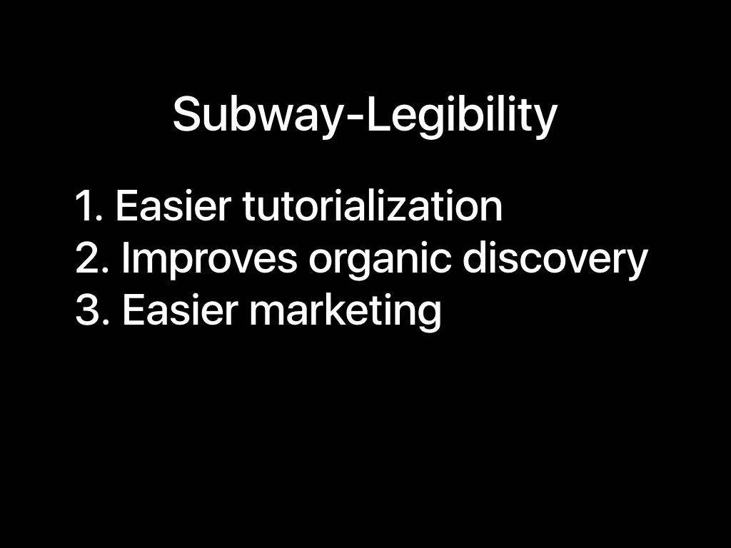
The more I started paying attention to mobile games, the more of these kinds of experiences I had... So when it came to designing my own games, I wanted to make sure they could sell themselves to strangers too. I figured the best approach would be to make games that presented themselves clearly and in such a way that they taught anyone watching how to play for themselves. Obviously that's a mouthful so let's just call it making your game 'subway-legible'.
Obviously no one piece of advice will make you successful, but I do think finding success relies upon finding the little tricks that work for you, and leveraging them as effectively as you can. Designing for Subway-legibility has been a very powerful strategy for me.
The reason why is that it ends up solving three problems at once. And as a solo developer, any time I can do two things at once, that's a big win.. so three is fantastic.
So what are those three things?
1. It makes implementing your tutorials less work. Your game will be easier to comprehend because it is presenting its information and state in a way that is designed to be naturally accessible. This means that when you sit down to make a tutorial (which, wow what a nightmare these are), half the work has already been done for you. And a better tutorial means more people who get into your game across all skill-levels.
2. Improves organic discovery. When your game is good at teaching onlookers to play, it'll draw in more viewers, and every player and every streamer of your game can focus on conveying how awesome it is, instead of constantly answering questions about how the game works
3. Easier marketing. Your screenshots and gifs will need little to no context, which makes pitching for coverage or going viral on twitter a lot easier. People say a picture is worth a thousand words, but thats only true if the picture makes sense.
Ok I get it you're probably thinking oh zach it's really easy to make games that are subway legible when you make tiny little indie games, what about me, with my big fancy pc/console game?
well it can be done

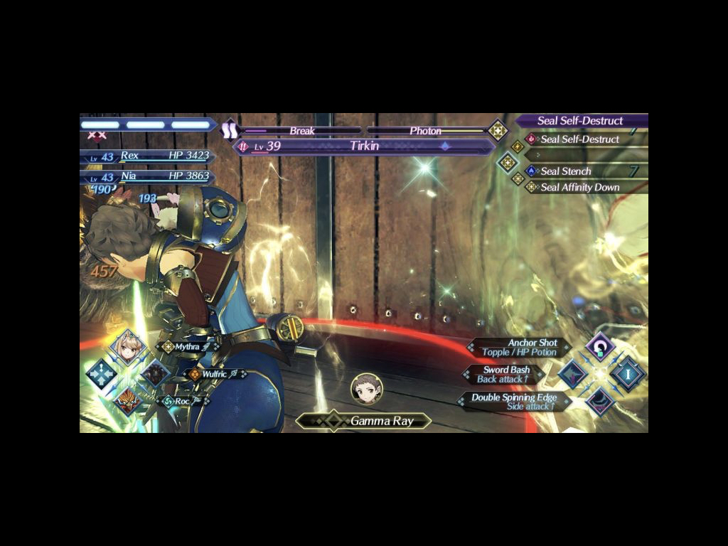
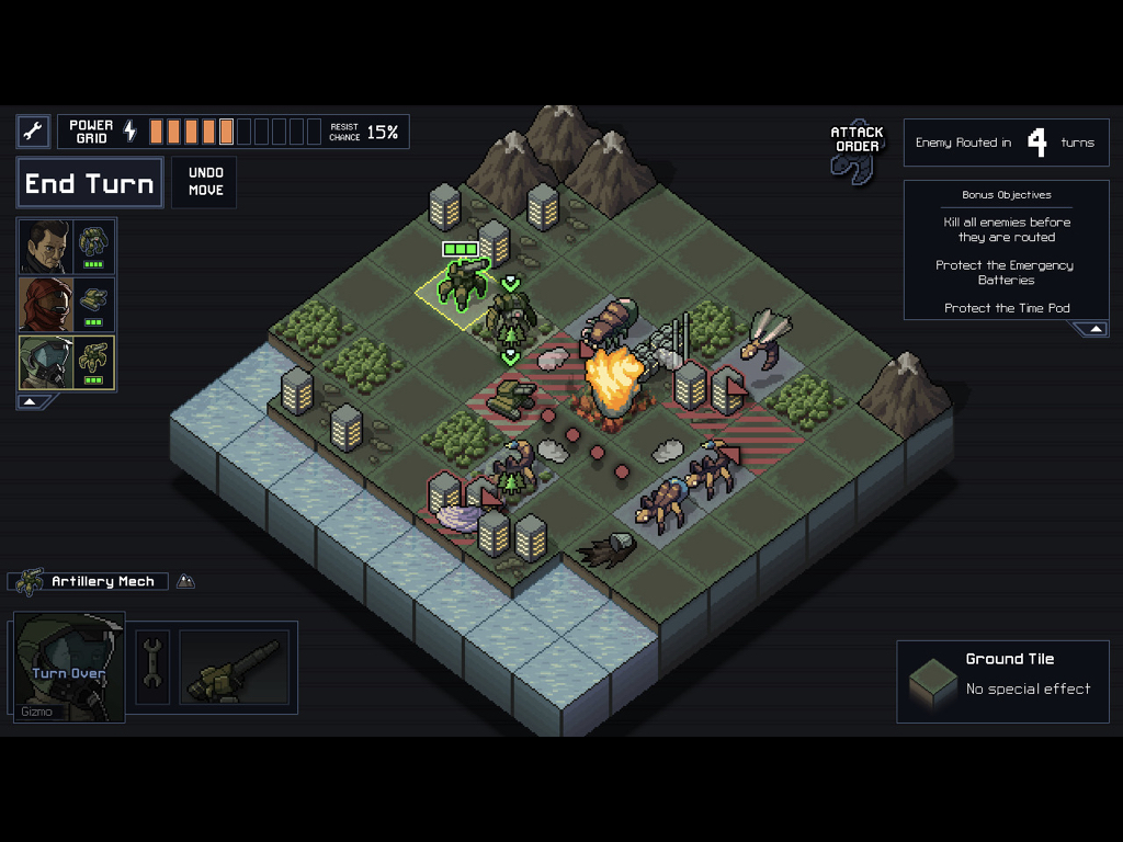
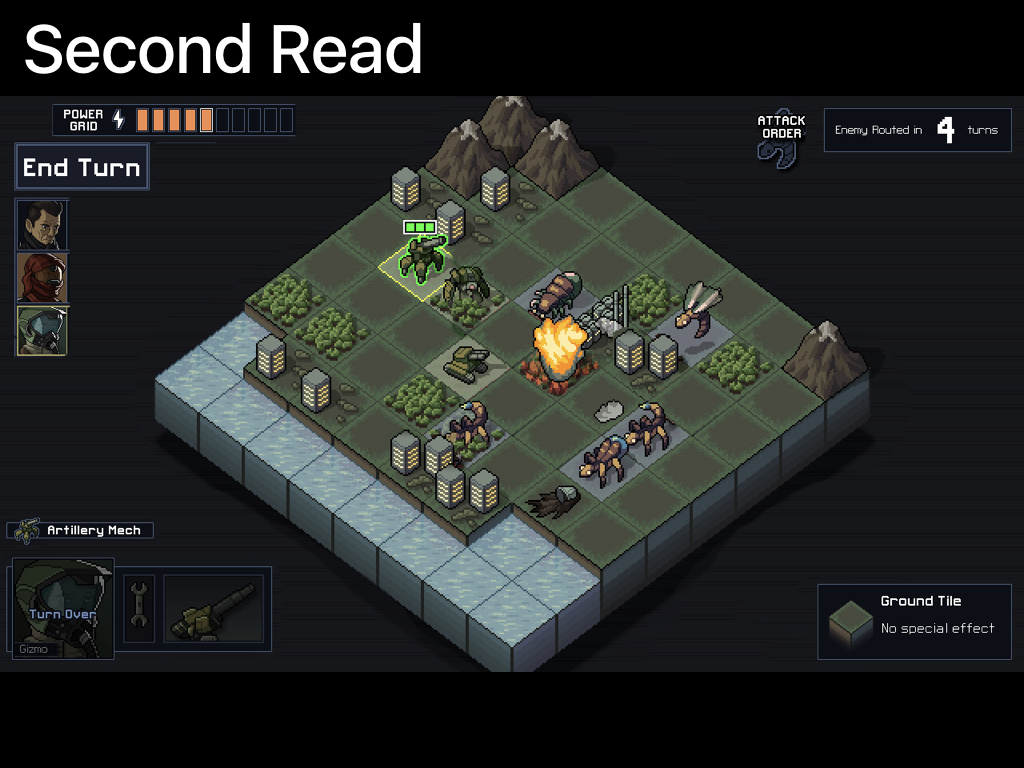
This is a screenshot of Into the Breach, which mostly everyone regards as a brilliant tactical strategy game, and I regard as an incredible example of information organization and UI design.
This screenshot went around twitter before the game came out, and I think we can see why pretty easily. Anyone looking at it can immediately tell that it:
- Involves huge Mechs and giant city-sized bugs (the word mech is literally written on the screenshot)
- Is turn-based
- You have a number of units.
- These bugs are doing something bad to the cities and tanks.
- Things are exciting and literally on fire
- The kind of tile you are standing on has a tactical effect (advance wars-style)
- It's science fiction and involves TIME PODS (also literally written on the screen, these guys are geniuses)
Dang that sounds exciting. I can already imagine what this game is like!
So how did they make that all so clear?
Ok some of the things I cover in this talk may seem incredibly obvious, but I find the best design rules are always simple and obvious. This is because they need to be simple enough for you to break them sometimes, and they need to be obvious enough that you'll remember to do them.
Back when I was in college studying design I was introduced to the principal of the Three Reads. At least that's what my brilliant design teacher Deb Hall called it, so that's what I'll call it when I explain it to you now.
It's the key to this whole thing, and if you come away from this talk with just one piece of information, make it understanding this.
The easiest way to understand The Three Reads is by thinking about a concert poster.
Say you're making a poster for an event.

Lets think about how posters are experienced. Generally, we see them on the street, which means a poster's audience is primarily limited by how far away it can be read! If you can only read it from 10' away, it's reaching a lot less people than if you can read it from 20' or 30' away.
That means, that we want to have our text be BIG! but we don't want ALL of the text to be big — that would be confusing, and it would seriously limit the amount of stuff we can put on the poster! So what should be big? Probably the things that will convince people to walk closer. Essentially, we are designing our poster to pitch itself.
Ok so First things first, who is performing?
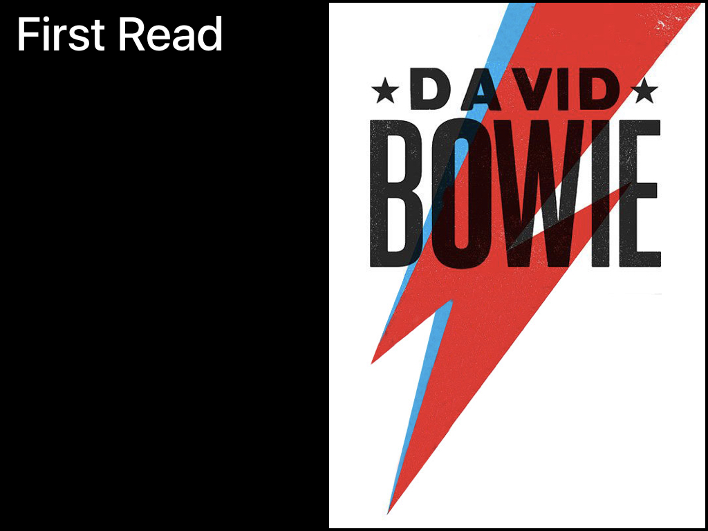
David Bowie (rest in peace).
There's our target market, if you like David Bowie, you're probably going to approach the poster. If you don't like David Bowie, I don't care about you anyway.
So that is the first read. The first thing people see when they see the poster, and it's meant to draw people in.
The second read is for people who have approached and are now looking for more information! Now we don't have to worry so much about how far away they are, so we can make the text smaller.
Here's what would go in the second read
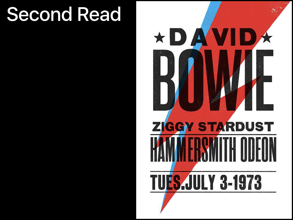
Where is this happening? When is it happening? Will it be Ziggy?
Hopefully now the viewer is interested, they like the venue, and they're free on tuesday.
Now we're finally to the third read...
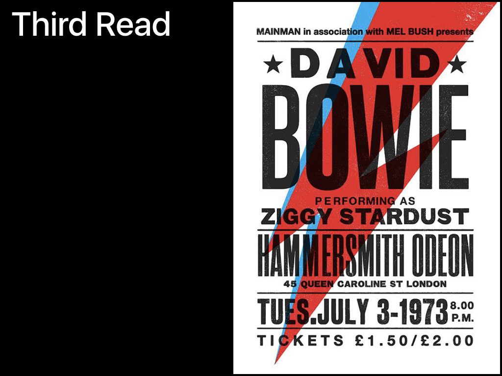
...Where we tell you how much it costs, remind you of the address, specify the time, and throw in all the extra little details we need that nobody actually cares about like who is presenting the show.
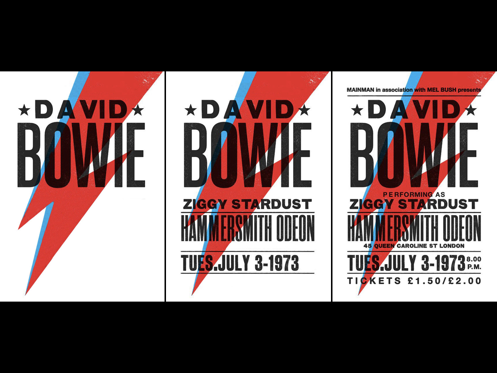
So there you go! That's the whole thing. It seems so simple right?
This kind of design structure works not just for rock posters, but also for videogames.
Let's go back to that Into The Breach Screenshot.
What drew our eye first?
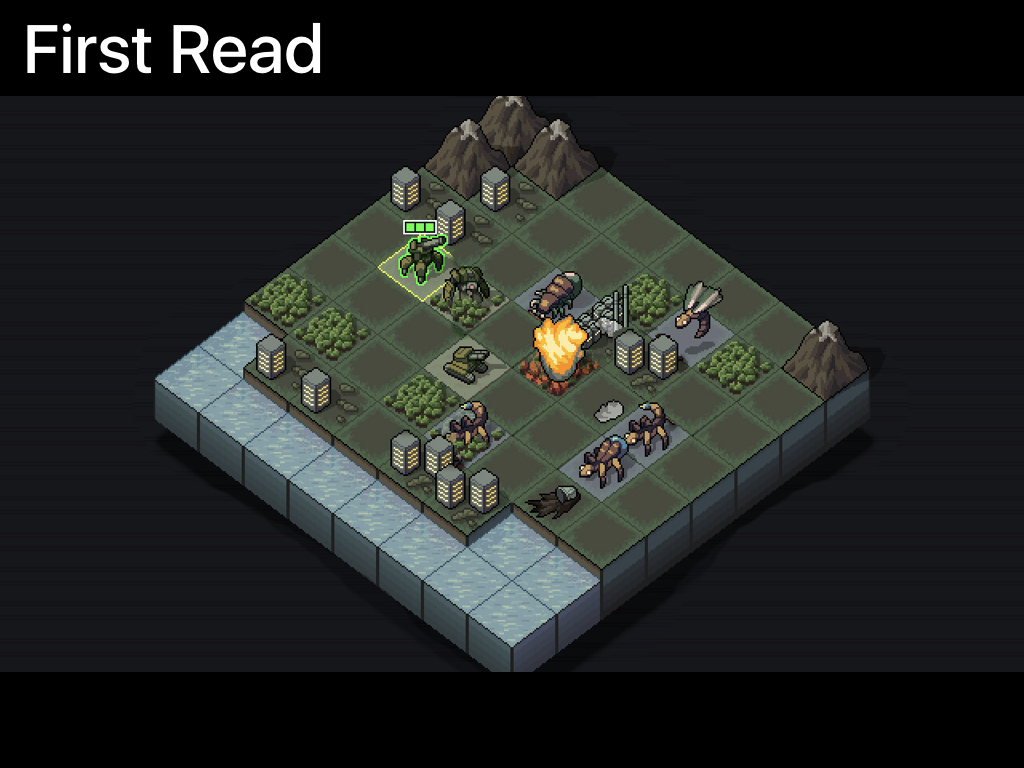
This giant grid, that feels a bit like advance wars, has what is clearly a player controlled unit, something is on fire, and there are a bunch of bugs.
What do we see next?
Whoa look at all these things to think about. It's turn based, I have 3 people, My health seems to be... the power grid?
I guess I have to survive 4 turns, I have a mech, and oh it looks like depending on where I place my units there are special effects. wow so it IS gonna scratch the advance wars itch that it set up on the first read
onto the third read,
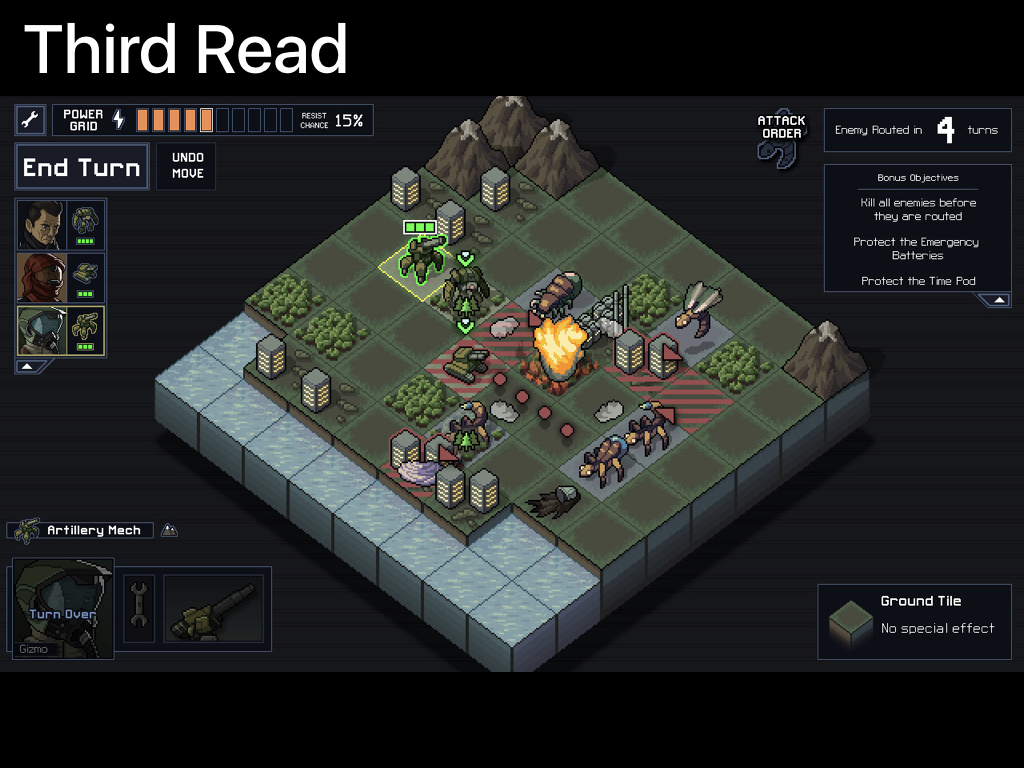
oh my units have health too! And there are bonus objectives, and whoa look at all this crunchy tactical data going on on the map! And Time Pods!
This screenshot takes you from "hey is that like advance wars" all the way through to "wow this is so much more exciting than advance wars"... Just by how the information is laid out!
So obviously this kind of clarity can help with your promotion, but how does it help us make better tutorials and improve word of mouth?
Something you may be familiar with from making tutorials is that generally when you teach something new, you want to introduce the rules in a specific order, so that players can build a mental model of how the game works, starting with the broad-strokes and then moving inwards towards the more specific rules.
Huh. That actually sounds a lot like how the three reads works.
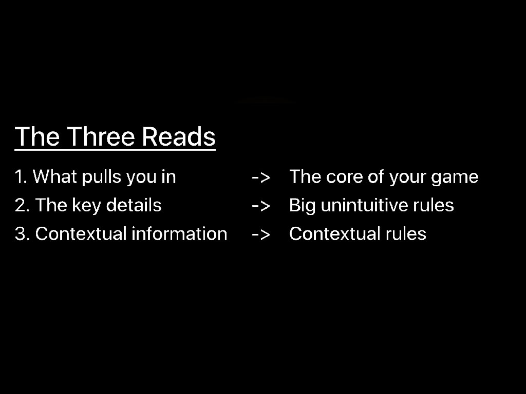
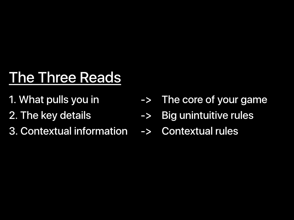
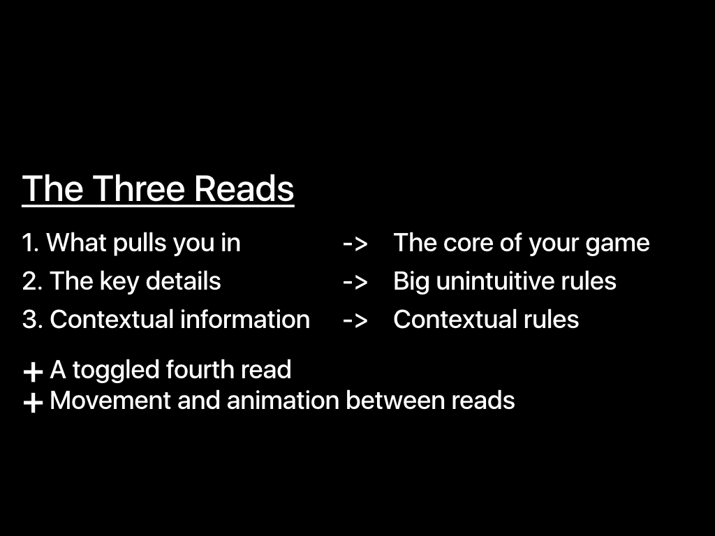
The first read pulls you in, and that's the core of your game
The second read fills in key details, or big unintuitive rules.
and The third read gives you contextually important information (like the time of the bowie show only matters if i can attend on that date) or gives you contextually important rules (like the what tile exactly a giant bug is targeting in Into The Breach only matters if i'm considering how to handle that bug).
A good tutorial teaches you things in the right order, and good design shows you things in the right order.
Lets look at my game SpellTower as an example.
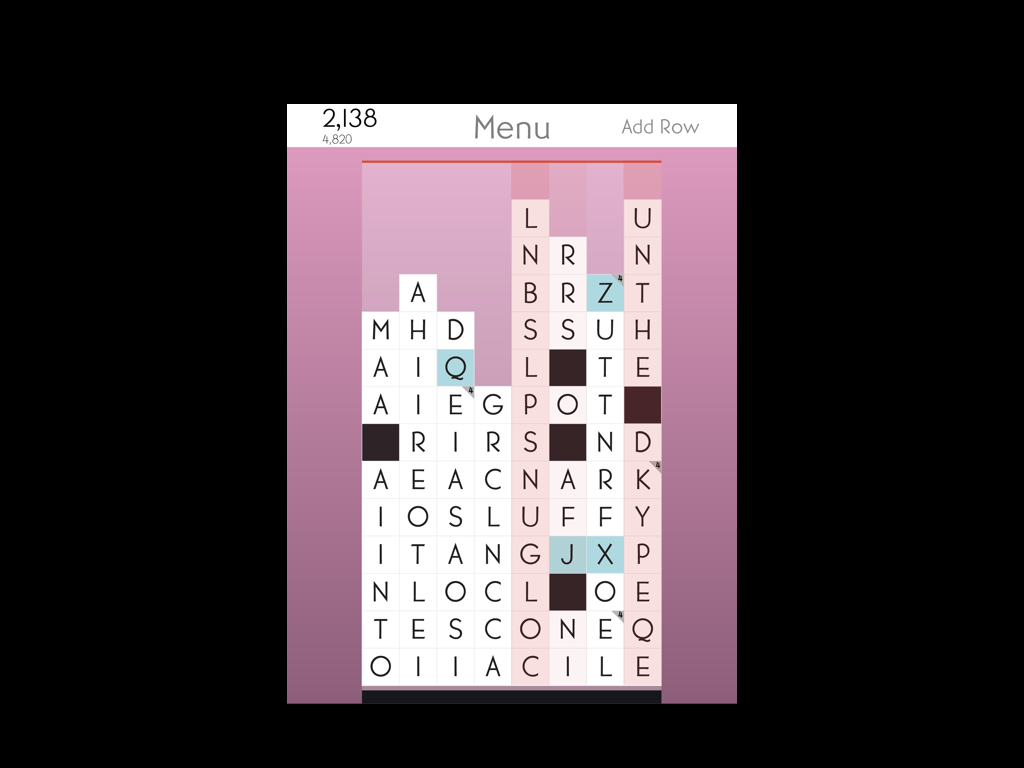
In SpellTower you're trying to keep your stacks of letters from reaching the top of the board, and you do this by spelling words to remove blocks.
Let's see what the three reads look like here.
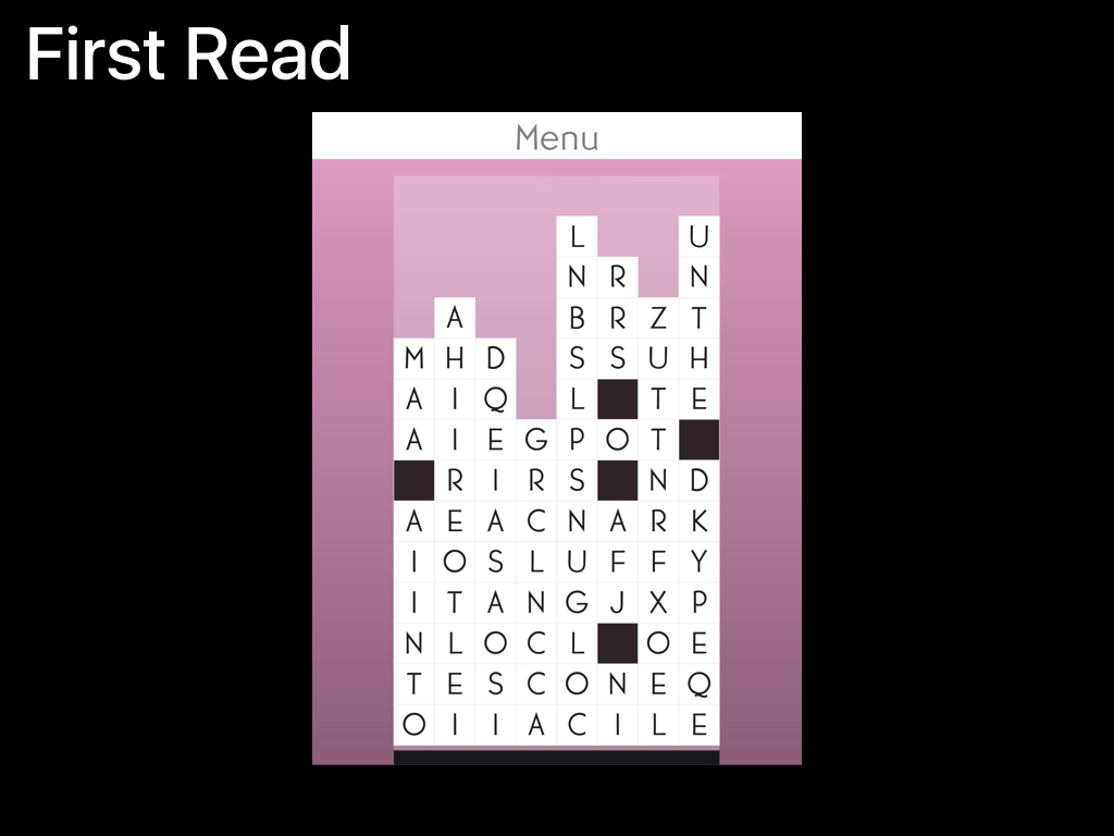
So, the first thing players need to see and think about are the letters! What words are there that I can spell?
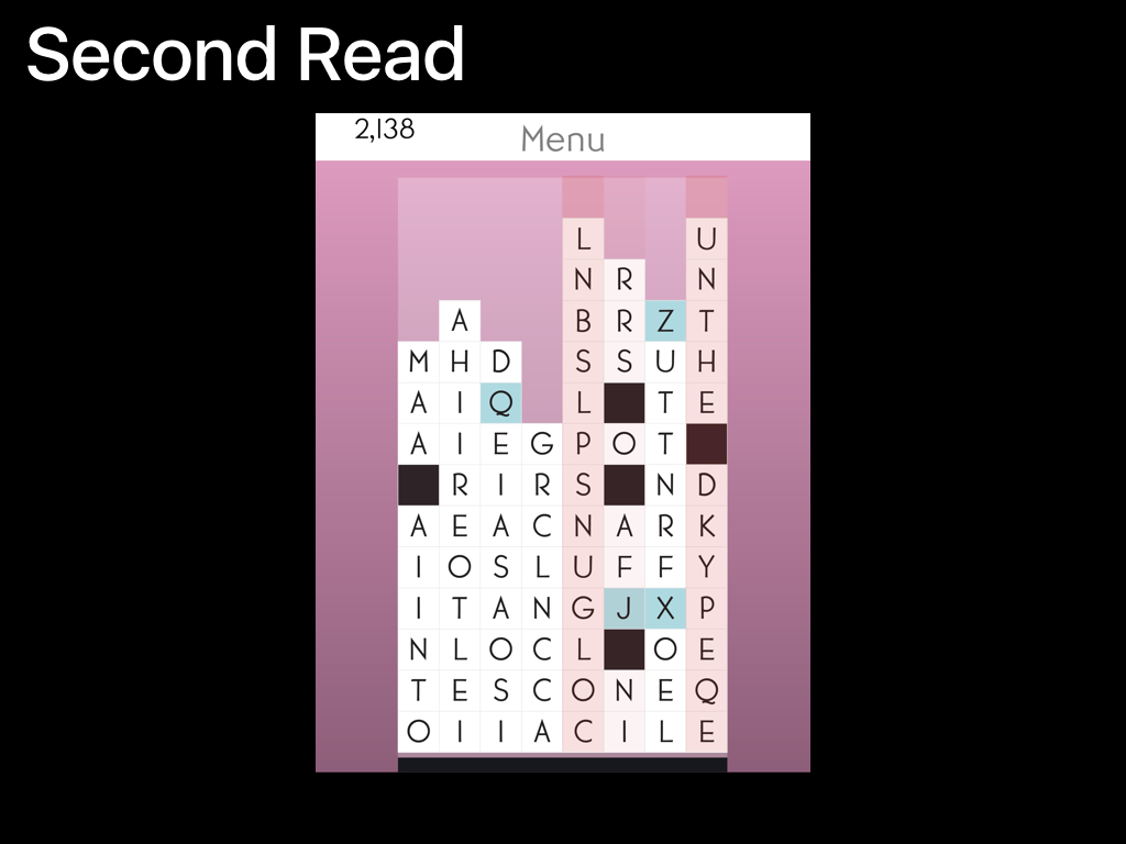
Once you're comfortable finding words, you need to think about which columns are getting close to the top, and which letters are special and extra helpful for reducing the height of your stacks. The blue letters for example, will clear out an entire row if they're used.
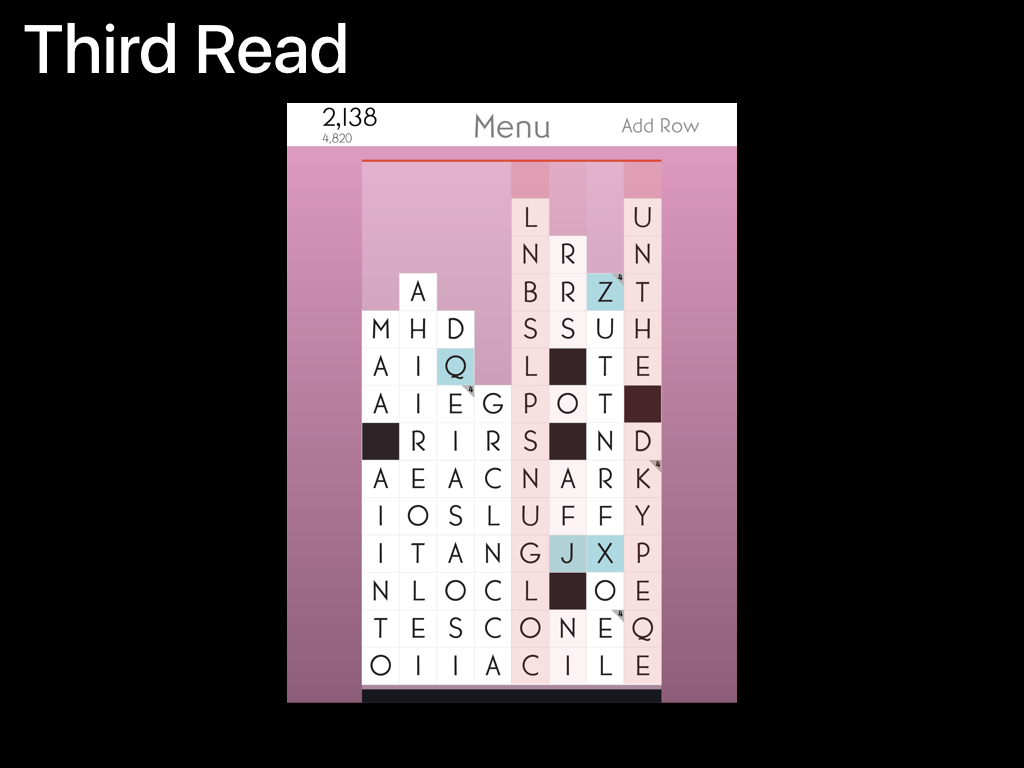
Finally, the third read, the information that is only contextually important — things like what your highscore is, or which tiles can only be used in 4-letter or longer words.
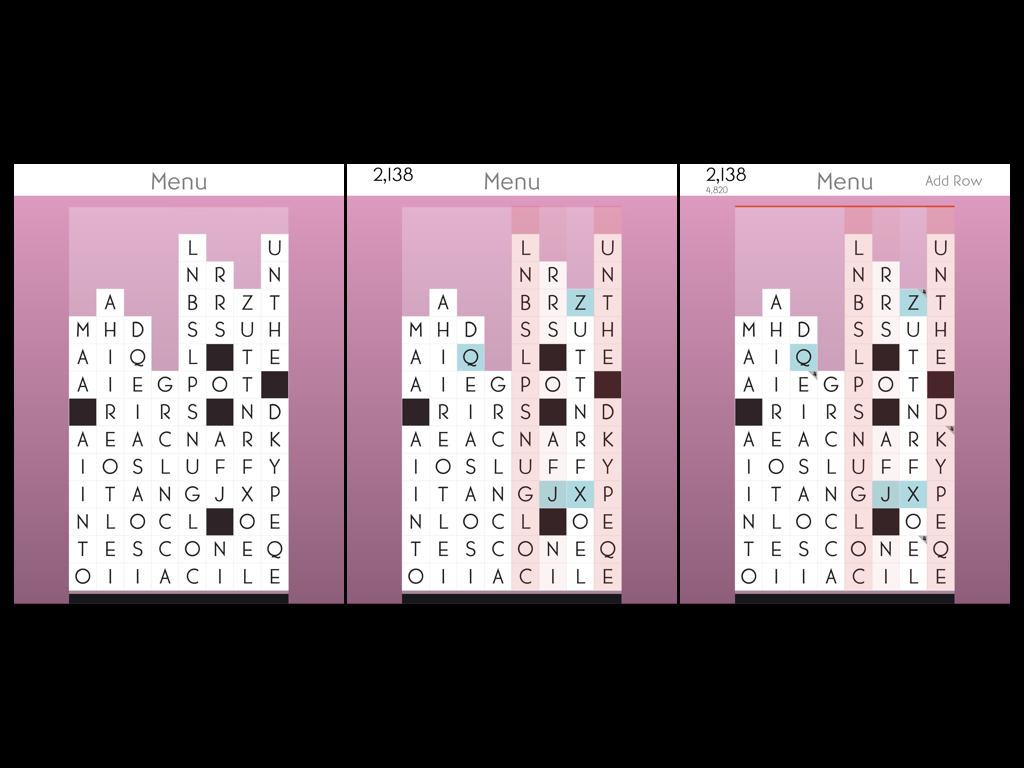
The layout reinforces how to approach the game, both for the player, and for someone looking over their shoulder.
That's it for how to do the Three Reads properly, Before we move on to advanced concepts let's take a quick look at what this can look like when it goes wrong.
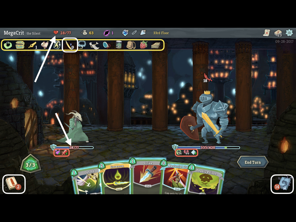
This is slay the spire, a game I enjoy quite a lot.
In fact, it's a game a lot of people really enjoy, and it's one that has done very well for itself, so I don't feel terrible subjecting it to a tiny bit of constructive criticism.
Slay The Spire actually does a really great job teaching the player how to play it, every single thing on this screen tells you what it means when you mouse-over it, and new concepts are doled out at a leisurely pace so by the time you end up with a screen like this, you understand every single thing.
The problem comes in when someone starts watching over your shoulder (or more often with a PC game like this, on Twitch).
If you have never played Slay The Spire, you probably wouldn't guess that the most important information on the screen is actually these little icons (circled in red). Those icons, more than the health, the armor, or the cards in hand, explain the state of the battle.
Not only are they the tiny, but even if onlookers notice them, they have no idea what they mean.
These should be in the second read, but they've been relegated to the third.
On top of that, this screen has a ton of empty space on it, but it still manages to look very busy. Nearly everything on this screen is a tiny icon with a number on it.
What are all of these things? (yellow) and how can you have something but have zero of it? (white)
Why is my health in two places, and two colors? (arrows)
And what are these Decks? (white) do they really need numbers? Couldn't number of cards be shown by size, and you wouldn't know this from the presentation, but they're actually the same deck. The right side is the discard. Shouldn't those cards be face up?
The problem isn't that all these icons are all displayed, It's that they're displayed at relatively the same scale, and that scale is larger than the things that actually matter in the moment, namely the tiny icons i outlined in red.
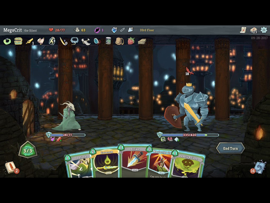
Here's what the reads of slay the spire look like:
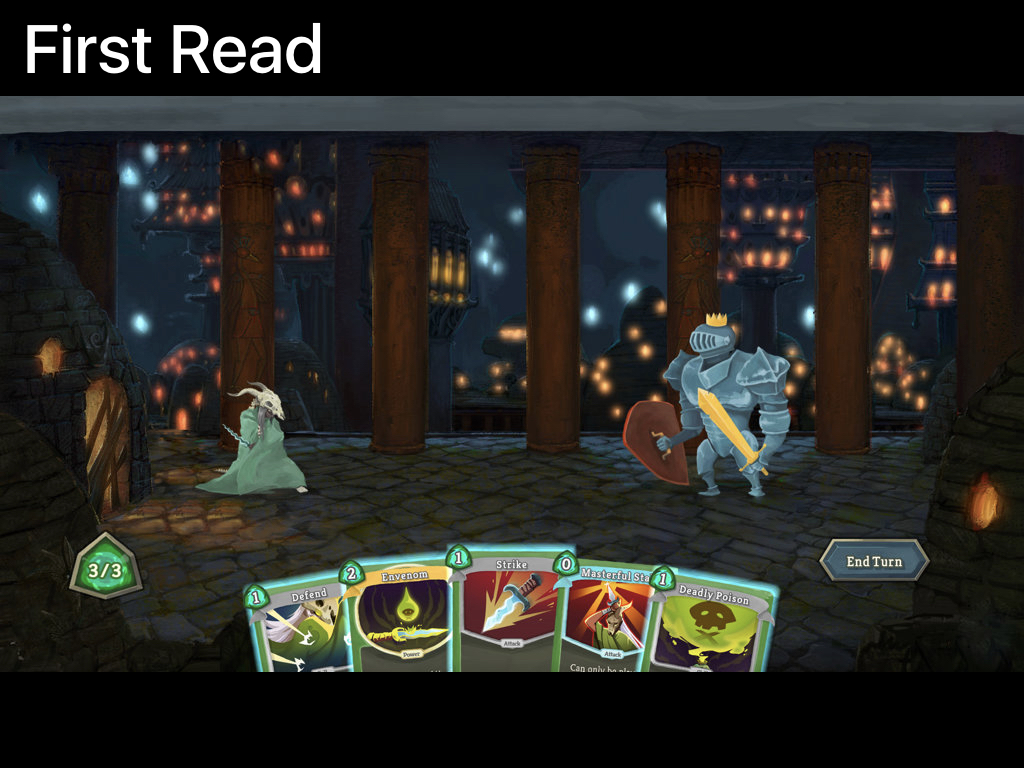
First Read: two characters, a hand of cards, an end turn button and the mana. So far so good!
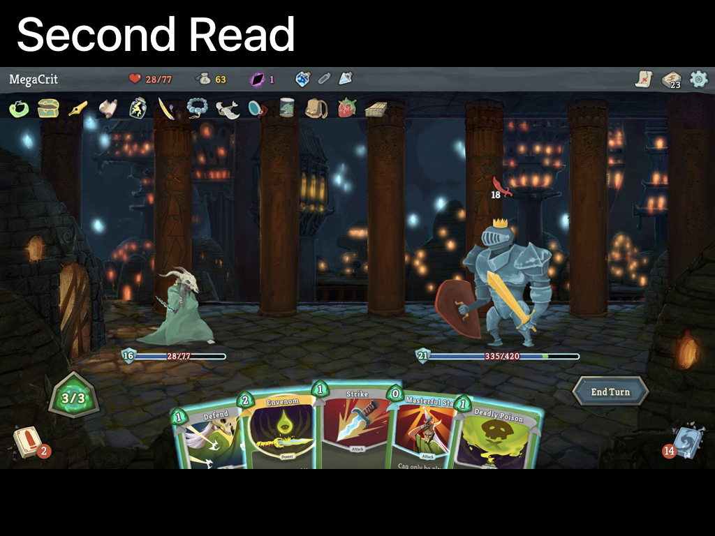
Second Read: Almost everything else. Uh oh.
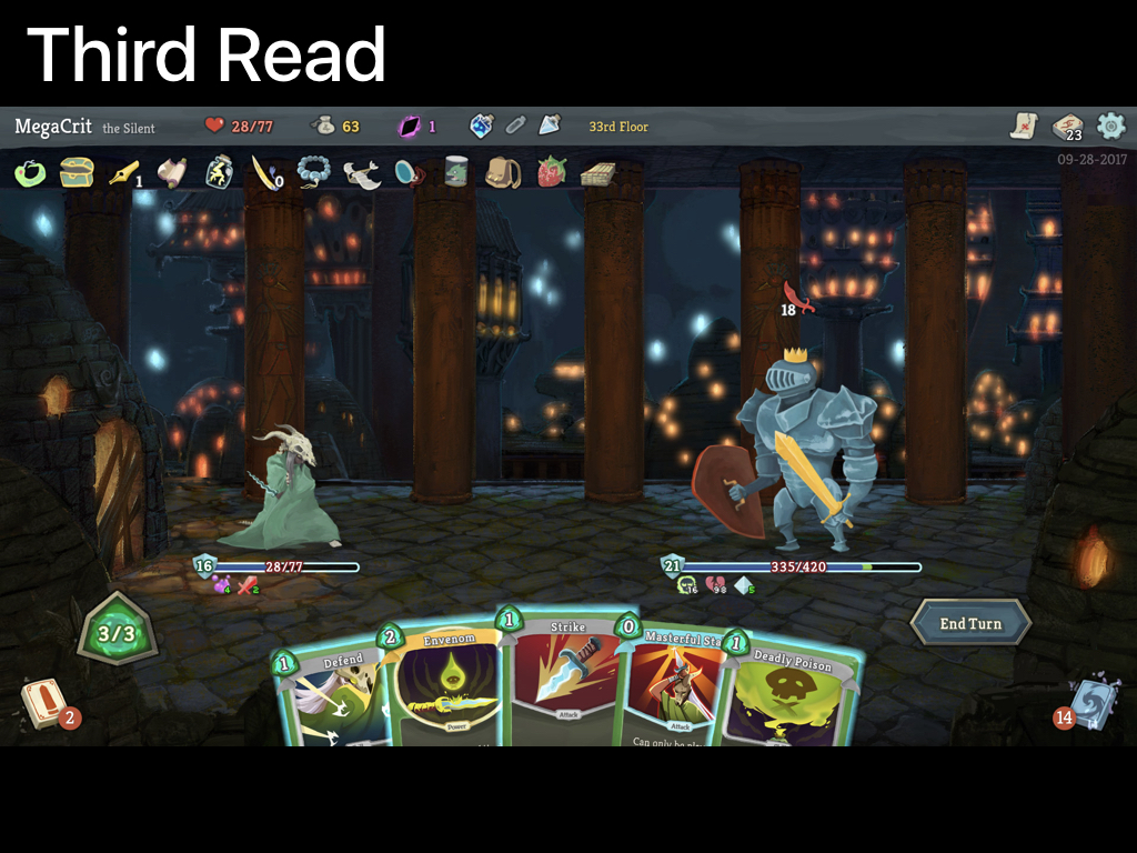
Third read: some small numbers and the all important status icons under the health bars
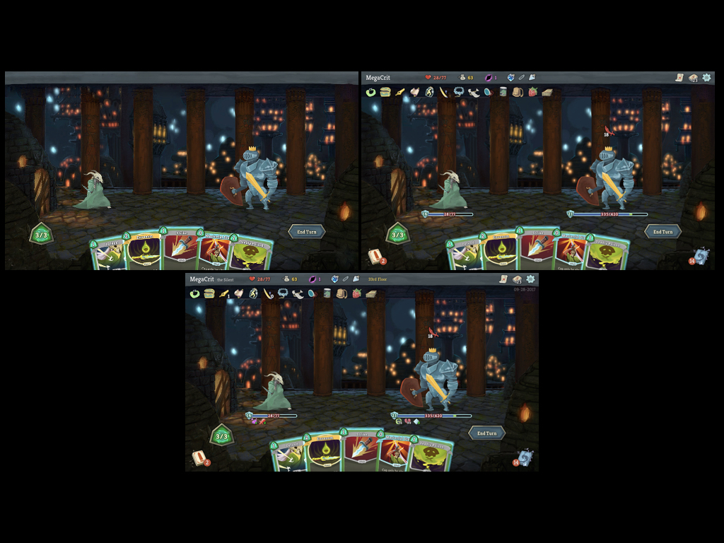
See how you can barely even tell the difference between the second and third reads? That is a pretty big sign that the second read is really overloaded.
I just want to remind you, I do love this game! if you worked on this and are in the audience, thank you for making such a great game! Also, I should say, slay the spire does actually mitigate a lot of this with really solid animations, that doesn't forgive the issue, but it helps a lot. Speaking of animation...
Ok. Hopefully you have a sense of what the first, second, and third read should look like. Now I'm going to cover some advanced stuff that posters can't do.
Unlike traditional print design, videogames, obviously, are interactive, and can move, and that provides you with a few additional options as a designer.
One of those options is using movement and animation to temporarily raise or lower the read of a game component. Blizzard does this really well in their game Hearthstone.
pay attention to the size changes and movement in the above video, and how they draw your eye.
Hearthstone is a constant wave of things being brought to your attention in the first read, and then fading back into the second or third reads. It's really masterful, but it's also a lot to consider as a designer, especially as you're just trying to learn about this stuff for the first time now. There's literally so much information being conveyed in this little video that if I tried to deconstruct it, it would take most of this talk
So lets take a look at much smaller example, in how I am trying to solve a rules comprehension problem in my game Typeshift.
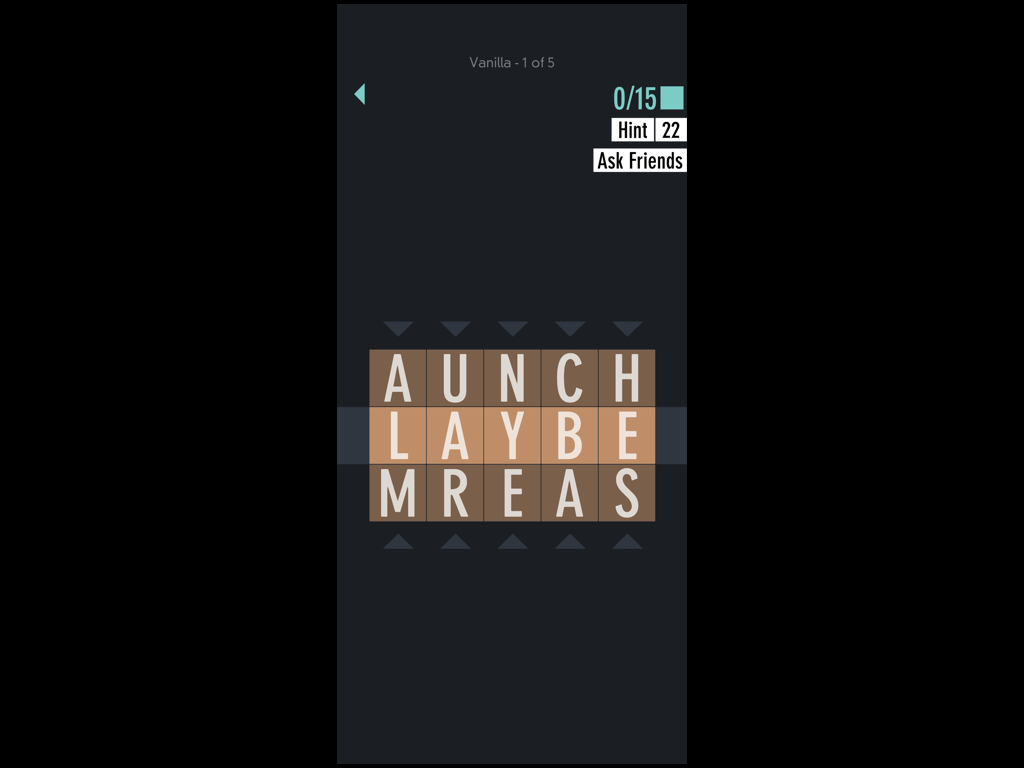
This is what a puzzle looks like in typeshift. Like SpellTower, the first read is the letters, the second is the background tile colors, and the third is the menus and minor decorative elements.
A longstanding issue I've had is that some players jump to the conclusion that their goal is to find *every word* in a Typeshift puzzle (because thats how most word-finding puzzles work). Actually though, in Typeshift, their goal is just to use every letter at least one time.
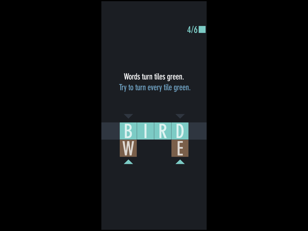
I tried to make this clear in the tutorial by showing that making a word turns your tiles green, and then saying that the goal is to turn all the tiles green, but that wasn't good enough for many players.
The problem is that the colored tiles are on the second read, and when they change color, it's just as players are finding a word, so they're focusing on the idea of finding words and their presumption that they have to find them all. They interpret the color change as a decorative element.
Click the video above to see what that looks like.
I'm about to launch an attempted fix that uses animation to bring tile backdrops temporarily into the first read, and I'm doing that animation just after they've found a word - a time when players aren't yet focusing on finding something new
So that looks like this (video above). It's a small adjustment, animating the color-change across the letters, instead of having it pop in, but it reinforces the importance of the color as more than decoration, because things in the first read are never purely decorative. I never would have come to this change, if I hadn't been considering the problem within the context of three reads. We'll see how it works out.
Another thing you can do in a game that you can't in a poster is provide hidden, toggled, information.
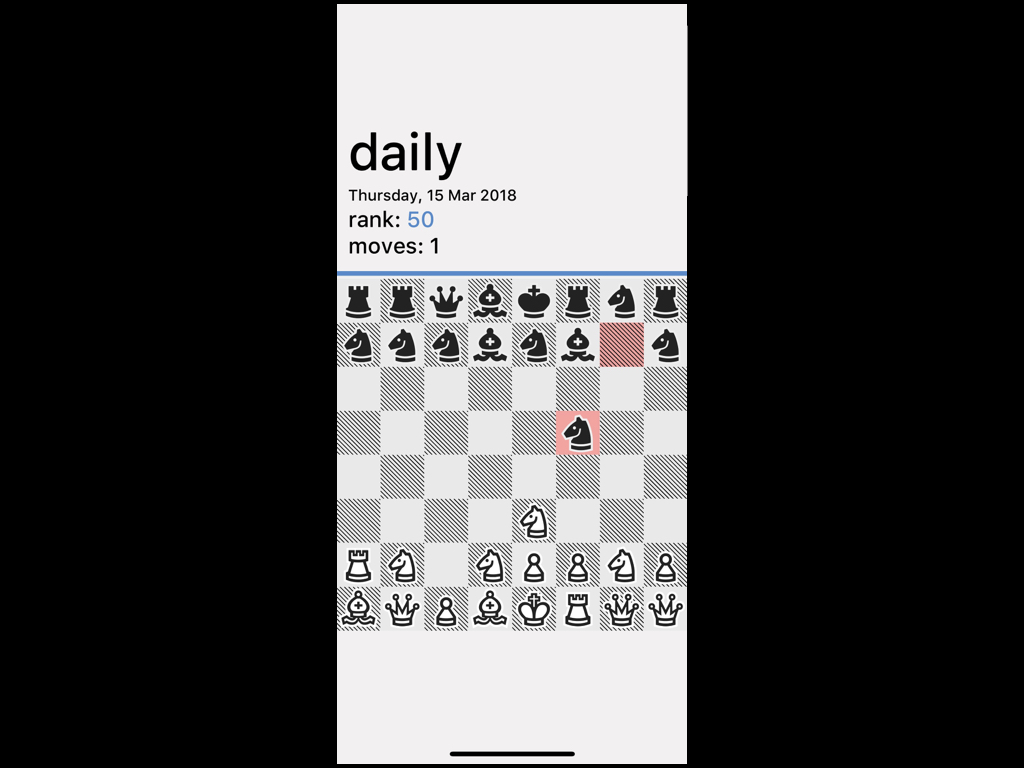
In really bad chess, I needed to have a bunch of menus on the screen to allow you to use undos, check scores, or just quit the game.
Unfortunately, those menus are horribly distracting. The problem is that in chess, the pieces are little. They're the most important thing on the board, but they're also very small, and very detailed, and can end up being overwhelmed by large simple shapes, like the menus. When I look at this screenshot, my eye is first drawn to the menus, and then to the board.
The problem is that the menus have invaded the first read.
Not only do they pull your eye away from the board, but they are also silently telling the player: These menus are the most important thing— and they aren't!
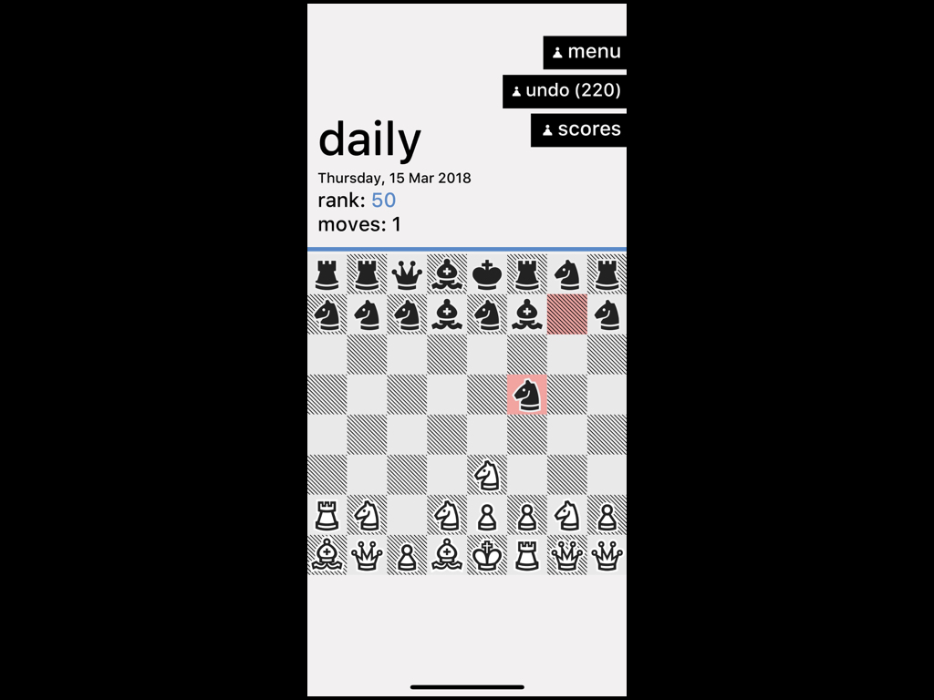
So to solve this, I made it so whenever you tap away from the menus, they slide out of the first read, and into the fourth, which is what I call the read for any hidden toggled information.
Now, the board, and the mode, are squarely in the first read, and everything looks balanced.
And when you do toggle open the menus, while they are in the first read, they're also what you're looking at, so it all feels natural.
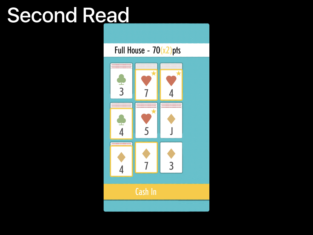
Ok, lastly let's take a look at my game Sage Solitaire, probably my most complex layout for setting up the three reads in a mobile game.
While designing Sage I had an issue where I had to include a lot of specific extra information on the screen that could be extremely distracting. My initial layout looked like this:
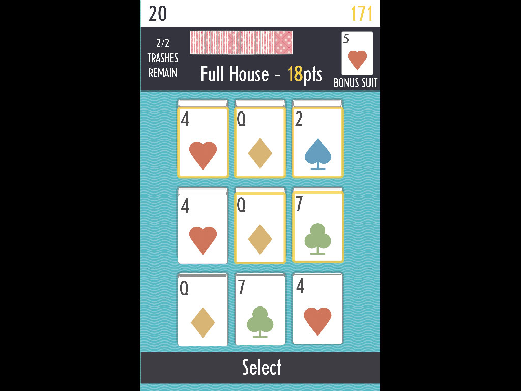
What a mess!
The first read is the cards, for sure, but read two, is basically everything up top. The name of hand, the stack of cards, the bonus suit, the trashes. It all blends together.
The problem was most these things shouldn't even be in the second read.
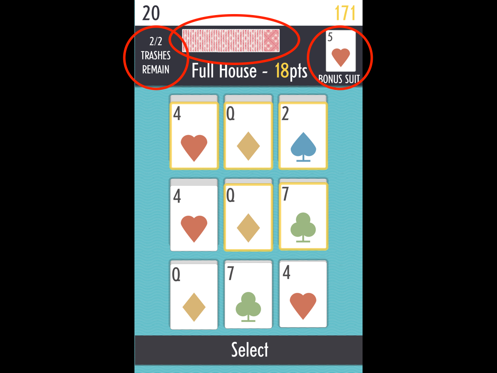
- the stack of cards is really just decorative
- the bonus suit (you really only need to reference it sometimes)
- how many trashes remain — important, but not important all the time.
Worse, there is actually something up there that you do need to know constantly, and that is the name of the hand you're playing and how many points it's worth.
If you didn't already know how to play, this certainly isn't going to help you.
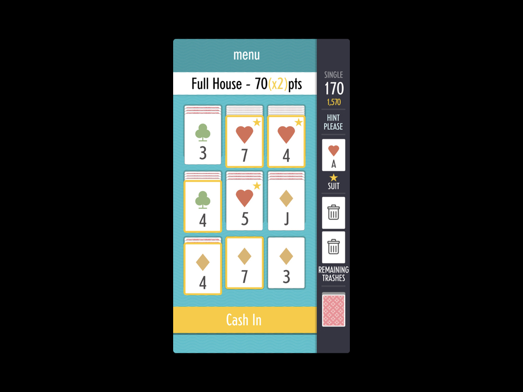
So, my solution was to break the screen down into a big play area containing the first and second reads, and a small side-column with all of the third read information.
Let's break it down.
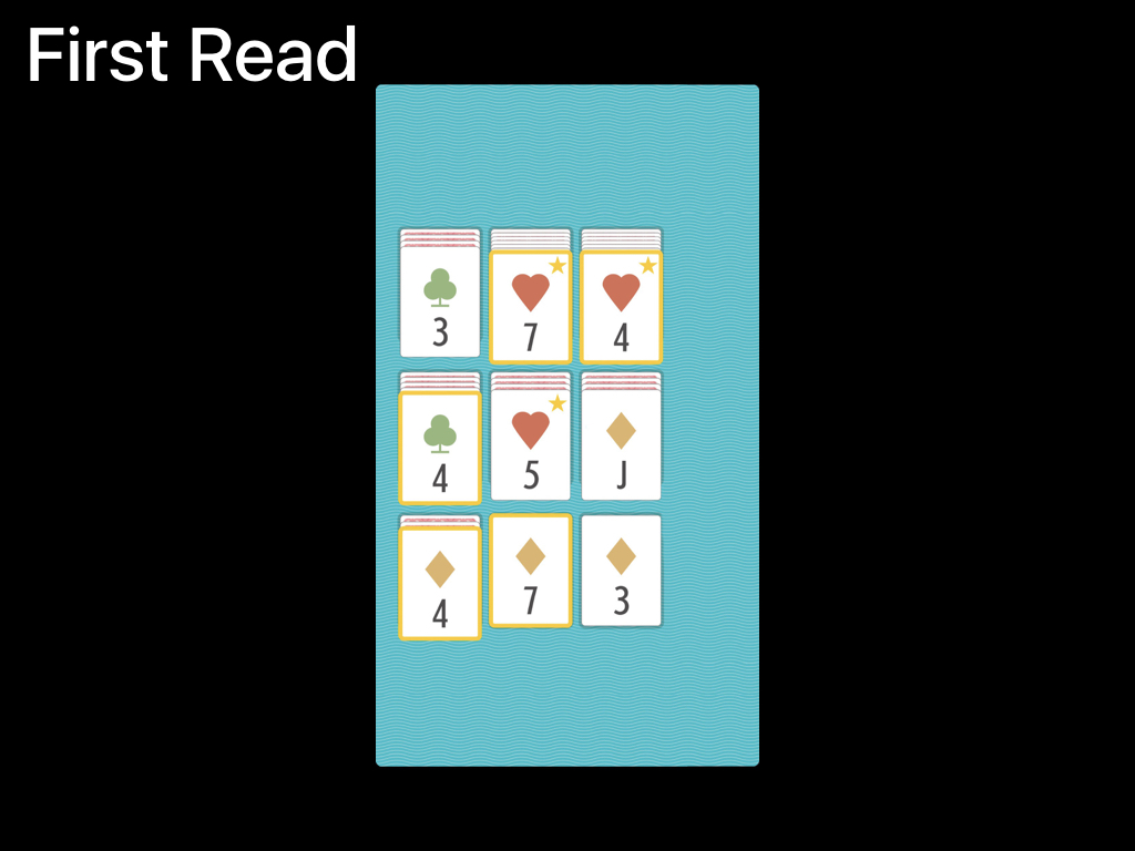
The first thing you see is the cards,
The second is the hand and the cash in button,
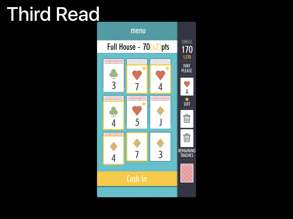
and last, you see the trashes, the suit, the score, a hint button, and your used card pile.
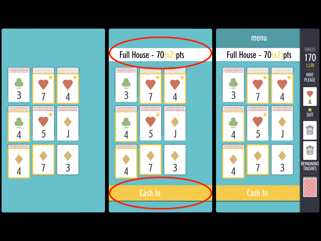
There's also a bit of a trick in this layout. Normally it would be an issue to have components that aren't always visible occupying the entirety of read 2. Sage would look really weird if both of these bars were gone when you didn't have a hand hilighted.
I deal with that by not actually getting rid of the top one.
When a hand isn't selected in Sage, it looks like this:
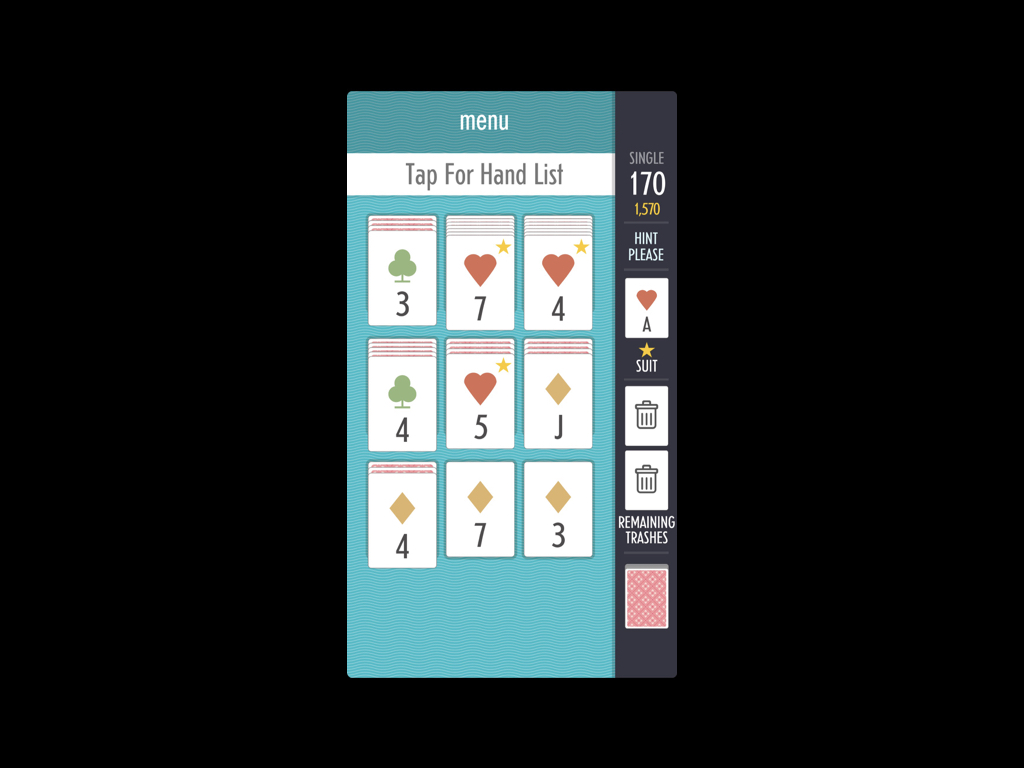
The cash in button is gone, but the big banner at the top now says 'Tap For HandList'. It's a giant help button.
I could have made it a little icon you tap, and stuck it in the 3rd read. But I wanted to drive home, both to new players, and also to over-the-shoulder players, that this is a game about making hands.
Usually in Solitaire you're moving cards around and making stacks, but Sage is about finding poker hands. Having the giant hand-list button existing as the entire second read (when you don't have a hand selected) prompts new players and watchers to think, "oh, I guess this is about hands". It also gives new players who may not know the standard poker hands a huge help button for them to push and be comforted by.
So there you go, not so bad right? lets recap:
You have three standard reads:
The first read pulls you in, and it explains the core of your game
The second read fills in key details, or big unintuitive rules.
and The third read gives you contextually important information (contextually important rules).
You also have a 4th read that comes from toggled information
And the ability to move things up and down in the reads structure through movement and animation
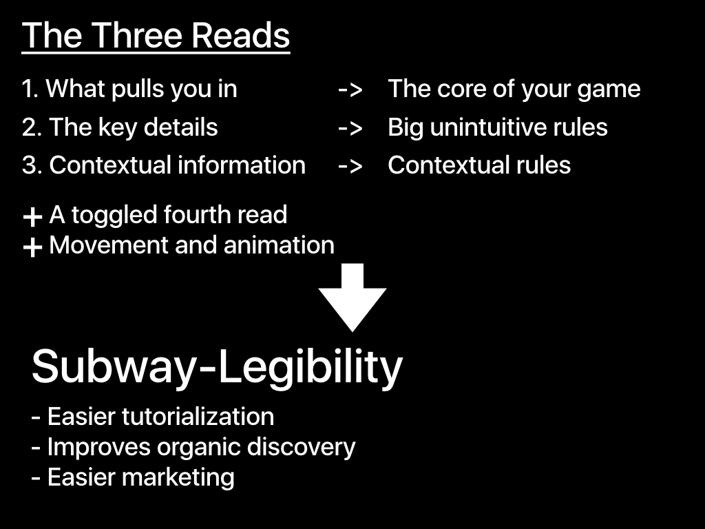
And if you do all of this stuff correctly, you get Subway-Legibility:
- It becomes much less work to make a great tutorial
- People see your game out in the world or on twitch and want to get it
- and Explaining what your game is with a screenshot or animated GIF becomes simple
I hope that was helpful!
Thanks
|